For my current project each student was assigned a novel from a list of what UK newspaper The Guardian considers to be the 10 best first lines in fiction (
http://www.guardian.co.uk/culture/gallery/2012/apr/29/ten-best-first-lines-fiction).
Here follows examples of each of the two typefaces I chose while working on this project-- the stipulation being that the typeface must have already been invented by the time of the author's writing. My assigned book, Wodehouse's
The Luck of the Bodkins was first published in 1935. The fonts I chose were Gill Sans (1926) and Baskerville (1756).
Gill Sans:
I have heard Gill Sans jokingly referred to as the Helvetica of England.
Eric Gill, its inventor, studied and apprenticed under Edward Johnston, who designed the iconic typeface used for the London Underground.
Gill was heavily influenced by Johnston's work, but set out to perfect it and create a perfectly legible, fool-proof typeface. His complete font family was commercially released in 1928 as Gill Sans. It became increasingly more popular when it became the standard typeface for the London & North Eastern Railway (LNER). In 1935 it was chosen to be put on the covers of the now iconic Penguin Books.
Major companies, including British Railways and the BBC (British Broadcasting Corporation), adopted Gill Sans as their corporate typeface.
Saab, a famous Swedish automobile manufacturer, has a slight modification of the typeface on their logo, and use Gill Sans as the exclusive font for their website and advertisements.
These British Railways signs direct travelers in Gill Sans, and the Scottish Region shade of blue. This was the standard British Railways style used on signs from c1948-1964.
Baskerville:
The Englishman John Baskerville (1706-1775) was a self-taught printer and typefounder. His work was widely dismissed during his lifetime, because he was regarded as an amateur by his British contemporaries. (He only began experimenting with printing in 1751). However, his influence eventually spread to France and Italy where Didots and Bodoni furthered his ideas.
The first book to use Baskerville's refined type was a book of Virgil's poetry published in 1757.
Benjamin Franklin, who himself had a printing business, was an admirer of John Baskerville and returned from their meeting in 1758 to the US with some of Baskerville's type, popularizing it with its adoption as the standard typeface for federal government publishing.
The 1920's saw a revival of Baskerville's typefaces as new fonts were released as revivals of his work.
This font's popularity continues today, in movie credits, print advertising, and published books.


__________________________________________________________________________________________
In addition to finding examples of our chosen typefaces, we were asked to search through The Book Cover Archive (
http://bookcoverarchive.com/) for examples of covers that focus mainly on typography. I really enjoyed perusing through all the beautiful covers posted on this site, and had a hard time choosing just 5 favorites-- but here they are:
I think this cover is successful because it gives you a sense of high action and mystery through the bold letters and deep shadows, and since Joe Gorges is a mystery writer, this is very fitting.
I think this cover is so clever in the way it goes about approaching the book's topic (which happens to be craftsmanship) and a way to visually represent it.
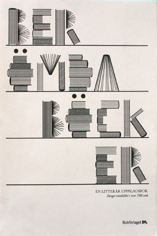
I think this cover is just beautiful, but then I do have a certain fondness for hand lettering. I also think this cover is completely brilliant because of the subtle ways the content of the book is made apparent by the images used in some of the letters (although its not as if one couldn't gather the content just by reading the title alone, which is quite apparent enough).
This one is not in English (not sure what language actually- do wish the site would give more information about the books they're displaying) but I adore the way this cover is completely legible despite the fact that the letters aren't really letters at all.
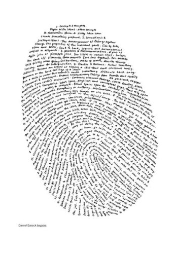
This one is just too cool. Hand-lettered again, but it is amazing the way that simple lines of text arranged in this way are so evidently representative of a fingerprint. And to make this book even more interesting, designer Daniel Eatock made each book unique by stamping his thumbprint onto the spine of each and every one that was printed.
I really enjoyed looking through all of these covers, and it is very helpful to get inspiration from things done well. However, now my problem is that I want to read all these books, and I simply haven't got the time! Guess I'll tack them on to the end of the summer reading list.


