It seems like I have a lot more text then most of my classmates. Chaplin speaks quite quickly, and says a lot in a short time. It is a little difficult for me to visualize the way the words will move by just writing on flat paper, but I am excited to get started in AfterEffects.
Wednesday, February 13, 2013
Expressive Type Storyboards:
Below are some storyboards, mapping out ideas for the way my speech will translate into a video.
It seems like I have a lot more text then most of my classmates. Chaplin speaks quite quickly, and says a lot in a short time. It is a little difficult for me to visualize the way the words will move by just writing on flat paper, but I am excited to get started in AfterEffects.
Tuesday, February 12, 2013
Movie Intro Inspiration:
SAUL BASS:
North by Northwest--
The text works in an environment here, becoming part of its surrounding space by taking on the perspective of the high-rise building behind it. When we see the busy streets with people walking past, the text moves onto and off of the screen in the same hurried manner. His exciting and upbeat choice of music also reflects this hectic, bustling city.
Psycho--
The music very much sets the eerie sort of scary tone for this movie, before any image or text even appears. The text comes onto the screen in a disjointed manner, coming apart again as it exits the screen. This disconnected typography gives us the idea of it being cut apart, fitting in with the horror/thriller tone.
Oceans Eleven--
I have not seen this film, so I don't already know exactly what the mood or tone is like with the other two films. However, the big, bright numbers and text made up of smaller dots immediately gave me the impression of Hollywood because they look like lightbulbs. However, gathering from the cards and dice, I think it may be Las Vegas. Saul Bass does an amazing job of integrating image and text. In terms of similarities between all three, he seems to incorporate a lot of simple shape, particularly rectangles.
MARLENE McCARTHY:
I Shot Andy Warhol--
The music immediately starts out very tense, and the text echoes this as it seems to oscillate and vibrate. The typewriter font used seems purposefully messy.
Safe--
Once again, dramatic and tense opening music sets the tone. I like how the type and image play off of each other, as the text reflects the light from the car's headlights.
American Psycho--
I think this opening is really clever. The dripping red liquid immediately resembles blood, and the music starts out a little slower and a bit creepy, but it flows into something a little more upbeat and classy as it becomes clear what the red liquid actually is. Also, the music and image are really cohesive, as the music starts each drip appears at the same time as the staccato note. The type itself is sort of simple and understated but elegant and clean.
I think the intro to the movie 300 (designed and animated by yU + Co.) is an inspiring opening sequence because it is so extremely dynamic. The font has a sort of graphic novel comic book vibe. I particularly like how as the view changes and the camera moves, the text stays where it was and you can see the dimentionality. It makes the text become very much an integral and cohesive part of the sequence. I like that the text is not just static and stationary, but becomes part of the imagery in the way it moves into and out of view, like the blood that spatters over each scene.
North by Northwest--
The text works in an environment here, becoming part of its surrounding space by taking on the perspective of the high-rise building behind it. When we see the busy streets with people walking past, the text moves onto and off of the screen in the same hurried manner. His exciting and upbeat choice of music also reflects this hectic, bustling city.
Psycho--
The music very much sets the eerie sort of scary tone for this movie, before any image or text even appears. The text comes onto the screen in a disjointed manner, coming apart again as it exits the screen. This disconnected typography gives us the idea of it being cut apart, fitting in with the horror/thriller tone.
Oceans Eleven--
I have not seen this film, so I don't already know exactly what the mood or tone is like with the other two films. However, the big, bright numbers and text made up of smaller dots immediately gave me the impression of Hollywood because they look like lightbulbs. However, gathering from the cards and dice, I think it may be Las Vegas. Saul Bass does an amazing job of integrating image and text. In terms of similarities between all three, he seems to incorporate a lot of simple shape, particularly rectangles.
MARLENE McCARTHY:
I Shot Andy Warhol--
The music immediately starts out very tense, and the text echoes this as it seems to oscillate and vibrate. The typewriter font used seems purposefully messy.
Safe--
Once again, dramatic and tense opening music sets the tone. I like how the type and image play off of each other, as the text reflects the light from the car's headlights.
American Psycho--
I think this opening is really clever. The dripping red liquid immediately resembles blood, and the music starts out a little slower and a bit creepy, but it flows into something a little more upbeat and classy as it becomes clear what the red liquid actually is. Also, the music and image are really cohesive, as the music starts each drip appears at the same time as the staccato note. The type itself is sort of simple and understated but elegant and clean.
I think the intro to the movie 300 (designed and animated by yU + Co.) is an inspiring opening sequence because it is so extremely dynamic. The font has a sort of graphic novel comic book vibe. I particularly like how as the view changes and the camera moves, the text stays where it was and you can see the dimentionality. It makes the text become very much an integral and cohesive part of the sequence. I like that the text is not just static and stationary, but becomes part of the imagery in the way it moves into and out of view, like the blood that spatters over each scene.
Expressive Typography Book:
Here are some screenshots of my book from our last critique on February 6th:
There isn't as much blatant visual language as some of my classmates' speeches, but I tried to bring drama to the words by the extreme weight and scale changes, as well as inverting the color on a few of the more powerful parts of the speech.
Saturday, January 26, 2013
Expressive Typography
Last week in class, as an introduction to our project, we began looking at expressive typography.
While we see expressive typography all the time these days in commercials and advertisements, I was impressed by the simple and intelligent way Chermayeff and Geismar were able to manipulate words to show their meaning more clearly in their book, Watching Words Move.
I went in search of more examples on-line and came across these that I particularly liked:
The introduction to Watching Words Move mentioned a few early examples of expressive typography, among which was A.A. Milne's Winnie the Pooh. While I was unable to find many good images of his original 1926 book, this particular page I think shows some expressive type in the simple way that the elongation of the text highlights the height of the tree.
I also came across Saul Steinberg, whose work I had never seen before. I thought this image showed type with a lot of expression. The artist is able to send his message so clearly, that behind all the man's fancy talk, the real underlying subliminal message he is sending is no.
I particularly like the way this set of posters uses movement of type to express the flow of the jazz music it advertises. I think it makes the text connect better on an additional level to the meaning of the posters.
While we see expressive typography all the time these days in commercials and advertisements, I was impressed by the simple and intelligent way Chermayeff and Geismar were able to manipulate words to show their meaning more clearly in their book, Watching Words Move.
I went in search of more examples on-line and came across these that I particularly liked:
I think this is a good example of a simple but effective was to visually portray a word. Just by altering the letter 'A' slightly, the designer was able to add an additional layer to the viewer's understanding of the word. I am drawn to the simplicity and how changing one small element can make such an impact.
I also came across Saul Steinberg, whose work I had never seen before. I thought this image showed type with a lot of expression. The artist is able to send his message so clearly, that behind all the man's fancy talk, the real underlying subliminal message he is sending is no.
I particularly like the way this set of posters uses movement of type to express the flow of the jazz music it advertises. I think it makes the text connect better on an additional level to the meaning of the posters.
The Great Dictator's closing speech:
For our newest project, we were to choose a powerful speech in order to learn about and work with kinetic and expressive typography.
I chose the famous speech from Charlie Chaplin's film "The Great Dictator": http://www.youtube.com/watch?v=dX25PDBb708
This film was met with some controversy when it came out in 1940, and was even banned in many parts of Europe. The United States was still formally at peace with Germany at the time of the film's first release. I think people
listening to this speech at that time would have had a very different reaction to it
than we do today. They were still in the midst of war and had not yet become
fully aware of the atrocities committed by Hitler, so Chaplin made a bold move with his strong statement against dictatorial regimes.
The film is described as 'a satirical attack on fascism'. I think the message is fairly clear,
though some might take the message and put it on a new level by
applying it to our modern times, which would not have been Chaplin’s intention.
Near the end of the speech Chaplin criticizes those who have risen to power who lie
and don’t fulfill their promises. He was referring to the rulers of his time,
but some might find this applicable to modern politicians. The speech drew significant debate at that time for its overt preaching, and continues to attract attention today.
I chose the famous speech from Charlie Chaplin's film "The Great Dictator": http://www.youtube.com/watch?v=dX25PDBb708
After choosing our speeches, we did some research in order to better understand their meaning:
_
Who is speaking?
Charlie Chaplin is speaking as the character Omler, the
protagonist, in the movie The Great Dictator.
_ Why was/is the
speech important to society?
The
speech makes the point that the human spirit and what makes us human is of
upmost importance. Chaplin chose to conclude his film with this speech, looking straight into the camera and professing his personal beliefs and political views. The speech condemns fascism and the Nazis and
those who take power away from the people.
_
Why do you feel it is important or interesting?
I think it is a reminder of the importance of humanity, what it
means to be human, and how important it is to hold on to our humanity in spite of everything. But ultimately it makes the point that we are innately good
and have the potential for freedom and beauty and happiness.
_
What is the emotion, mood, tone, personality, feeling of the speech?
I think it has a tone of optimism, that despite our
struggles, we the people will ultimately prevail against all odds. It feels hopeful, offering encouragement.
_ What is intonation,
emphasis, what is loud, stressed, or soft. Where are there pauses?
The speech has quite a build-up, beginning in a softer tone
and becoming very impassioned. In terms of pauses, they are frequent but very
short, with only a couple long ones.
_ What do you FEEL
should be loud or soft, long pause or rushed?
It is overall an urgent speech and therefore it makes sense for the oration to be loud and fast-paced. It carries a powerful message, so the delivery should be equally as powerful.
_
Is there a call to action? When listening to it what are key/emphasized words?
I think there is a call to action, because the speech is ultimately a plea for democracy, rousing the people
against tyranny. Some of the most heavily emphasized words are men,
liberty, you, and people.
_
How does it make you feel?
It makes me feel proud of the fact that we have defeated those dictators and gives me a feeling of gratitude that I have freedom and liberty. It also gives me a feeling of great hope when he says that each and
every person has the power to make life beautiful.
_
How do imagine that the audience felt?
_
Could there be another interpretation of the speech?
_
Write/find a short bio of the person giving the speech
Charles Chaplin was born in 1889 in England and died 1977 in
Switzerland. His working life in entertainment spanned over 75 years. Chaplin became a global icon and was one of the first international film stars. He is most recognized as an icon of the silent film era and is
considered one of the greatest filmmakers in the history of American cinema.
Monday, October 22, 2012
Sunday, September 9, 2012
Get To Know Your Typeface
For my current project each student was assigned a novel from a list of what UK newspaper The Guardian considers to be the 10 best first lines in fiction (http://www.guardian.co.uk/culture/gallery/2012/apr/29/ten-best-first-lines-fiction).
Here follows examples of each of the two typefaces I chose while working on this project-- the stipulation being that the typeface must have already been invented by the time of the author's writing. My assigned book, Wodehouse's The Luck of the Bodkins was first published in 1935. The fonts I chose were Gill Sans (1926) and Baskerville (1756).
Gill Sans:
I have heard Gill Sans jokingly referred to as the Helvetica of England.
Eric Gill, its inventor, studied and apprenticed under Edward Johnston, who designed the iconic typeface used for the London Underground.
The first book to use Baskerville's refined type was a book of Virgil's poetry published in 1757.
Benjamin Franklin, who himself had a printing business, was an admirer of John Baskerville and returned from their meeting in 1758 to the US with some of Baskerville's type, popularizing it with its adoption as the standard typeface for federal government publishing.
The 1920's saw a revival of Baskerville's typefaces as new fonts were released as revivals of his work.
This font's popularity continues today, in movie credits, print advertising, and published books.
In addition to finding examples of our chosen typefaces, we were asked to search through The Book Cover Archive (http://bookcoverarchive.com/) for examples of covers that focus mainly on typography. I really enjoyed perusing through all the beautiful covers posted on this site, and had a hard time choosing just 5 favorites-- but here they are:
Here follows examples of each of the two typefaces I chose while working on this project-- the stipulation being that the typeface must have already been invented by the time of the author's writing. My assigned book, Wodehouse's The Luck of the Bodkins was first published in 1935. The fonts I chose were Gill Sans (1926) and Baskerville (1756).
Gill Sans:
I have heard Gill Sans jokingly referred to as the Helvetica of England.
Eric Gill, its inventor, studied and apprenticed under Edward Johnston, who designed the iconic typeface used for the London Underground.
Gill was heavily influenced by Johnston's work, but set out to perfect it and create a perfectly legible, fool-proof typeface. His complete font family was commercially released in 1928 as Gill Sans. It became increasingly more popular when it became the standard typeface for the London & North Eastern Railway (LNER). In 1935 it was chosen to be put on the covers of the now iconic Penguin Books.
Major companies, including British Railways and the BBC (British Broadcasting Corporation), adopted Gill Sans as their corporate typeface.
Saab, a famous Swedish automobile manufacturer, has a slight modification of the typeface on their logo, and use Gill Sans as the exclusive font for their website and advertisements.
These British Railways signs direct travelers in Gill Sans, and the Scottish Region shade of blue. This was the standard British Railways style used on signs from c1948-1964.
Baskerville:
The Englishman John Baskerville (1706-1775) was a self-taught printer and typefounder. His work was widely dismissed during his lifetime, because he was regarded as an amateur by his British contemporaries. (He only began experimenting with printing in 1751). However, his influence eventually spread to France and Italy where Didots and Bodoni furthered his ideas.The first book to use Baskerville's refined type was a book of Virgil's poetry published in 1757.
Benjamin Franklin, who himself had a printing business, was an admirer of John Baskerville and returned from their meeting in 1758 to the US with some of Baskerville's type, popularizing it with its adoption as the standard typeface for federal government publishing.
The 1920's saw a revival of Baskerville's typefaces as new fonts were released as revivals of his work.
This font's popularity continues today, in movie credits, print advertising, and published books.
An interesting fact about this font (from a very interesting article): "A research study showed that the use of the Baskerville font increased the likelihood of the reader agreeing with a statement by 1.5% as compared to the average of 5 other fonts."(http://opinionator.blogs.nytimes.com/2012/08/08/hear-all-ye-people-hearken-o-earth/)
__________________________________________________________________________________________
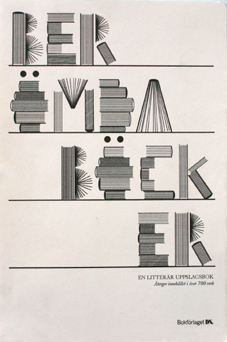
In addition to finding examples of our chosen typefaces, we were asked to search through The Book Cover Archive (http://bookcoverarchive.com/) for examples of covers that focus mainly on typography. I really enjoyed perusing through all the beautiful covers posted on this site, and had a hard time choosing just 5 favorites-- but here they are:
I think this cover is successful because it gives you a sense of high action and mystery through the bold letters and deep shadows, and since Joe Gorges is a mystery writer, this is very fitting.
I think this cover is so clever in the way it goes about approaching the book's topic (which happens to be craftsmanship) and a way to visually represent it.
I think this cover is just beautiful, but then I do have a certain fondness for hand lettering. I also think this cover is completely brilliant because of the subtle ways the content of the book is made apparent by the images used in some of the letters (although its not as if one couldn't gather the content just by reading the title alone, which is quite apparent enough).
This one is not in English (not sure what language actually- do wish the site would give more information about the books they're displaying) but I adore the way this cover is completely legible despite the fact that the letters aren't really letters at all.
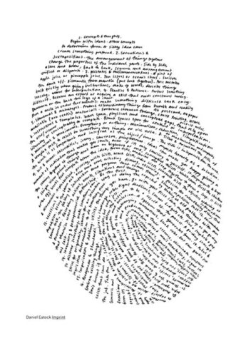
This one is just too cool. Hand-lettered again, but it is amazing the way that simple lines of text arranged in this way are so evidently representative of a fingerprint. And to make this book even more interesting, designer Daniel Eatock made each book unique by stamping his thumbprint onto the spine of each and every one that was printed.
I really enjoyed looking through all of these covers, and it is very helpful to get inspiration from things done well. However, now my problem is that I want to read all these books, and I simply haven't got the time! Guess I'll tack them on to the end of the summer reading list.
Subscribe to:
Posts (Atom)